The Vietnam Veterans Memorial Fund (VVMF) built The Wall. Today, they seek to remember those who served in Vietnam and to educate future generations about the Vietnam War and its impact on veterans and society. VVMF came to Corporate Zen for a redesign of their primary website.
Overview
My research revealed that VVMF’s core user group, Vietnam Veterans and their families, has a few unique attributes. To increase usability for this key group, I incorporated several design elements to meet the needs that my research identified. During discussions, VVMF expressed a desire to present long-form content in an easily navigable format, so I created pages with side navigation that lets users jump to areas of content and doubles as a content outline. The project had a tight timeline, but by maintaining focus on the core goals and working efficiently we delivered the site ahead of schedule, while factoring in the needs of key users and VVMF.
My Role
In this project, I served as the UI / UX designer and project manager (PM). I also did the QA during development. I enjoyed the diversity of the work on this project and being involved from start to finish. Project managing sites that I’ve designed and done UX work on allows me to make sure the final product stays true to the design and the UX research.
Project Management
As a PM, I initiated the project by identifying the main goals through discussions with VVMF. I then created an initial set of requirements based on these goals, which I continued to add to and edit as I did my UX and visual design work. Once VVMF approved the final design, I turned the mockups and requirements over to the development team. I then answered questions the developers had, making my own decisions for smaller items, while bringing more fundamental questions to the client. I also closely monitored development progress to make sure the site stayed on track. Throughout the project, I worked directly with VVMF to make sure the website met their goals.
UX Research
I started research by looking at competitor websites and reviewing VVMF’s Google Analytics data. This project had a tight timeline that did not allow for traditional user testing. However, VVMF had received and compiled feedback on their existing website for years. I also had prior experience working with VVMF to make design edits to their existing site based on user feedback. VVMF's knowledge of their users, combined with my prior experience and the Google Analytics data, revealed:
(A) The population often did not understand when an item was clickable. They preferred clearly labeled links and responded especially well to buttons.
(B) Many users did not have good eyesight and needed larger, bolder fonts to ensure readability.
(C) Google Analytics showed that the users still favored desktop over mobile.
(D) Google Analytics and user feedback, established the Wall of Faces (a memorial section of the site discussed and shown below) as the biggest draw.
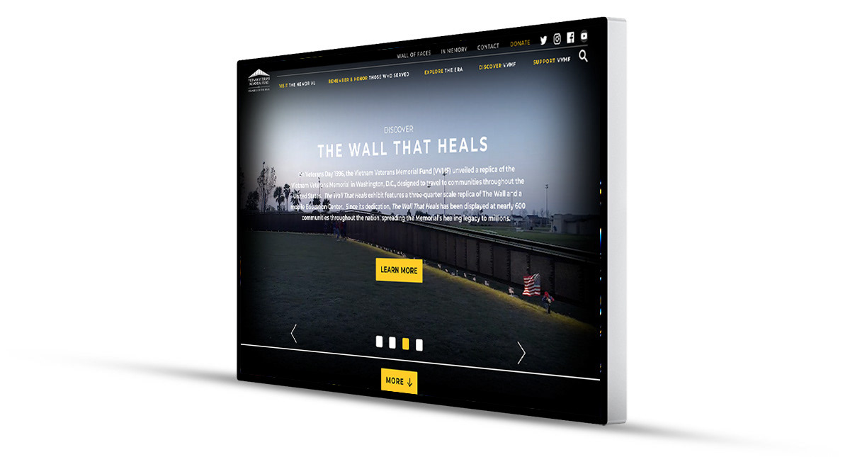
UI / UX Design: Choosing a Look
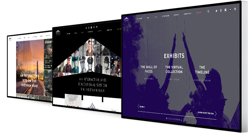
Three homepage options presented to VVMF as part of the process of choosing an appearance. VVMF chose the one on the right, but we updated the color palate.
As I usually do, I started the design process by asking VVMF to describe their desired aesthetic and to find five representative websites. Following my standard practice, I created three homepage mockups (shown above) based on the sites and VVMF’s feedback. Each mockup had a different concept and used different colors and fonts. I find that choosing colors and fonts works better when done in the context of an actual mockup instead of through mood boards or other means (more details on my process are available in that section). VVMF chose the option on the right. After some discussions, we adjusted the colors to stay closer to the color scheme of their existing website.
UI / UX Design: A Side Menu to Simplify Navigation
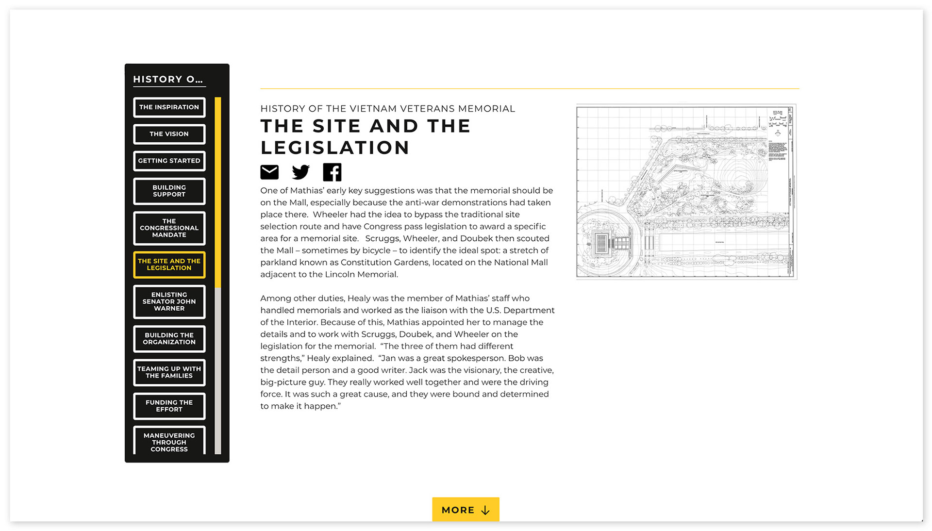
VVMF planned to have long pages, covering multiple topics. To help users navigate these lengthy pages, while also providing an outline of the page, I created a sidebar menu that automatically pulls in each section heading on the page. When users click a heading in the sidebar, they are auto scrolled to that section. I made the sidebar sticky with the current section highlighted so users always have a sense of where they are within the content.
UI / UX Design: Extra Buttons
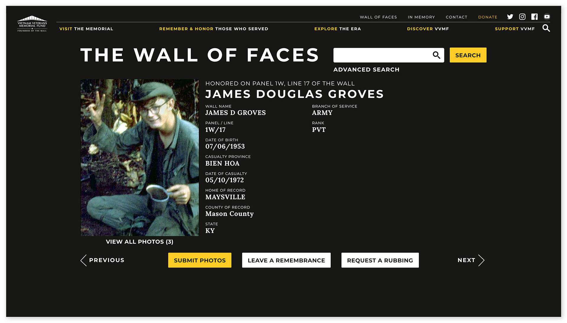
Individual profile on VVMF's Wall of Faces, showing an example of increased use of buttons.
Based on the research that revealed user’s strong preference for buttons, I went against the general practice of limiting use of buttons to key tasks and desired actions. Instead, I embraced a host of buttons and, at VVMF’s request, even had the developers build in shortcode so that VVMF admins can add their own buttons directly in the WordPress WYSIWYG editor. I was especially conscious of the need for buttons on the very popular Wall of Faces portion of the website (individual Wall of Faces profile shown below). Rather than making only the action we wanted users to take (submitting photos) a button, I made all 3 actions buttons but emphasized the desired action with color.
Working on a project like this, I came across many moving comments and stories. I believe VVMF is doing a lot to promote healing and understanding, and I was honored to be a part of this project.