Overview
This bi-lingual website came out of a partnership between the Vietnam Veterans Memorial Fund (VVMF) and the Korean Government. The project called for a site that would honor and remember Koreans who died during the Vietnam war. The site had no photos to start, but my design had to account for photos that users may add in the future. I also designed the site so that it would work and look good in both English and Korean. Getting the design right, took several iterations but, in the end, everyone involved was pleased with the site.
My Role
I worked with VVMF to create a design for the website. Once VVMF approved the design, I served as project manager during the site's development, testing, and launch. We had a compressed timeline but managed to deliver the site ahead of schedule.
UI / UX Design: Text Only
VVMF also maintains websites honoring US and Australian veterans. Those websites center on image based memorials to the veterans. However, this site had no images, only text. The lack of photos meant I had to completely rethink the design used on VVMF's other memorial sites and focus more on what the other sites represented - remembering and preserving the legacies. As I usually do, I started with rough sketches to brainstorm different ways to present the information.
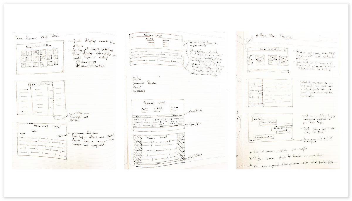
A few of the sketches I created while coming up with a concept for the ROK Honor Roll website.
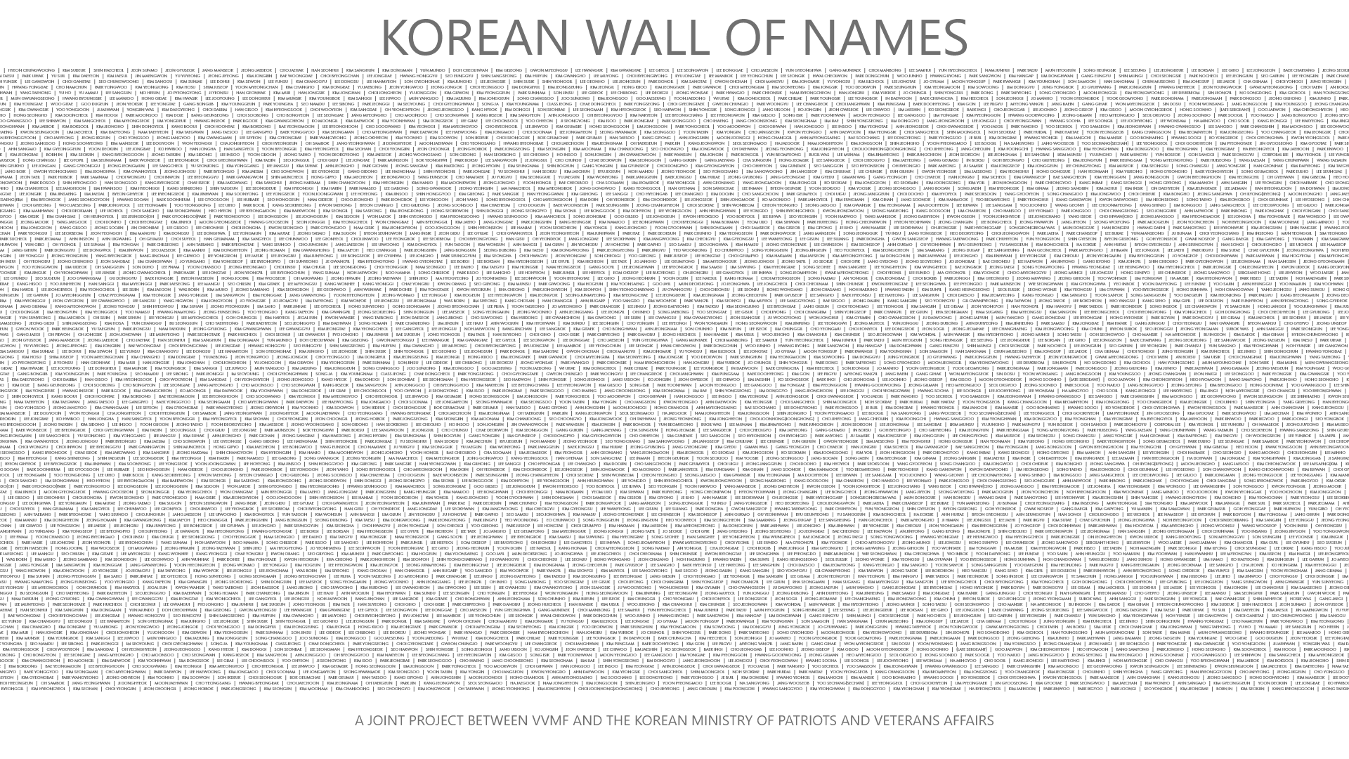
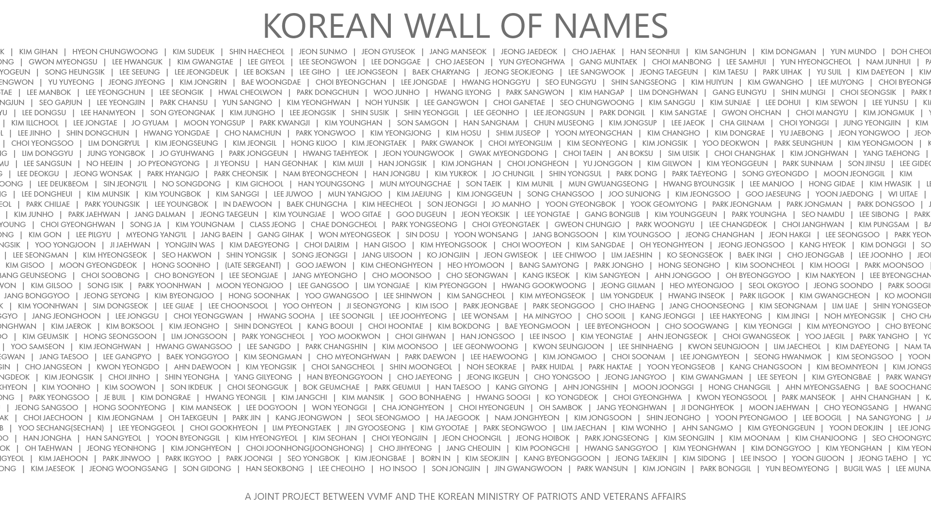
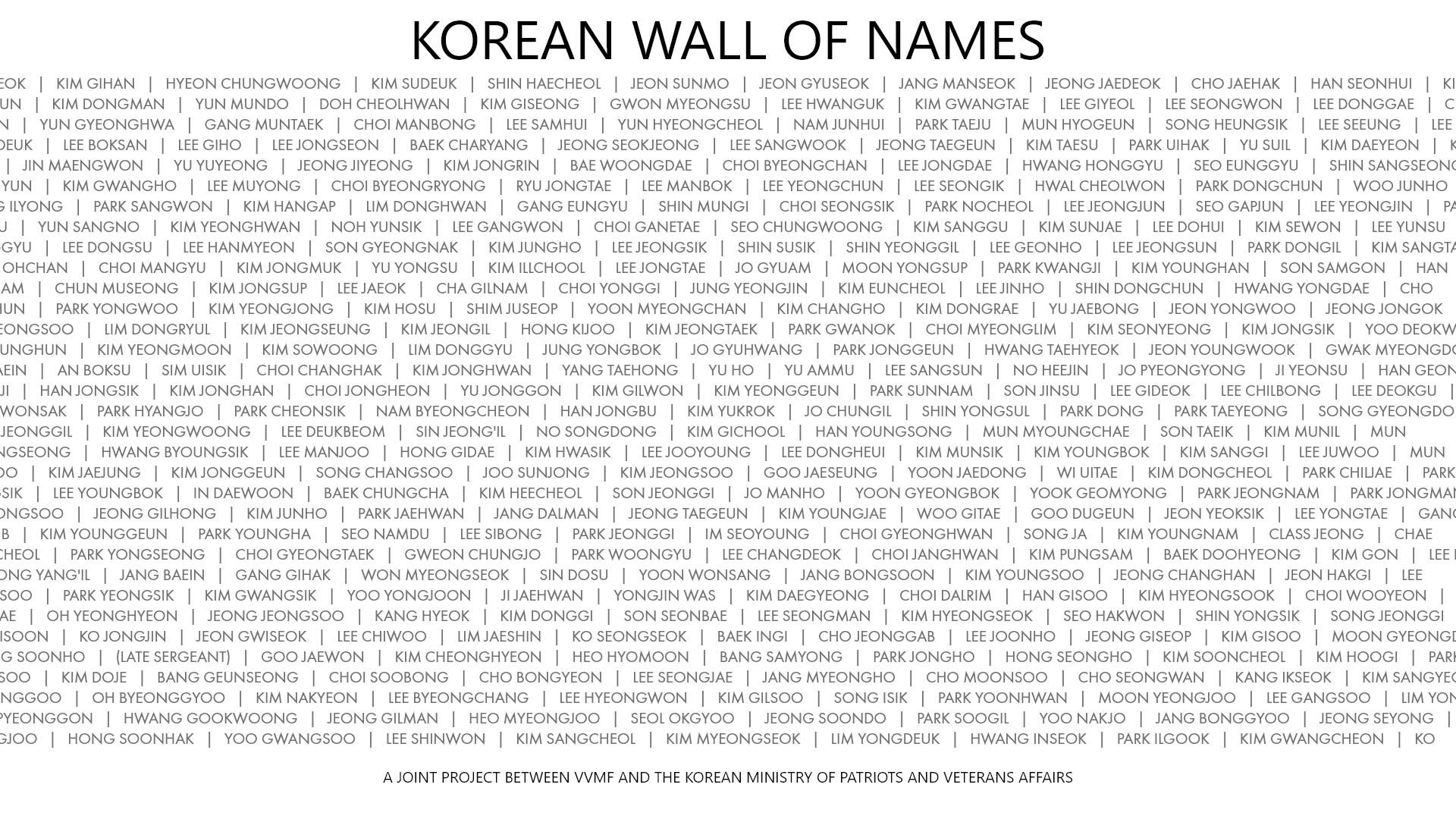
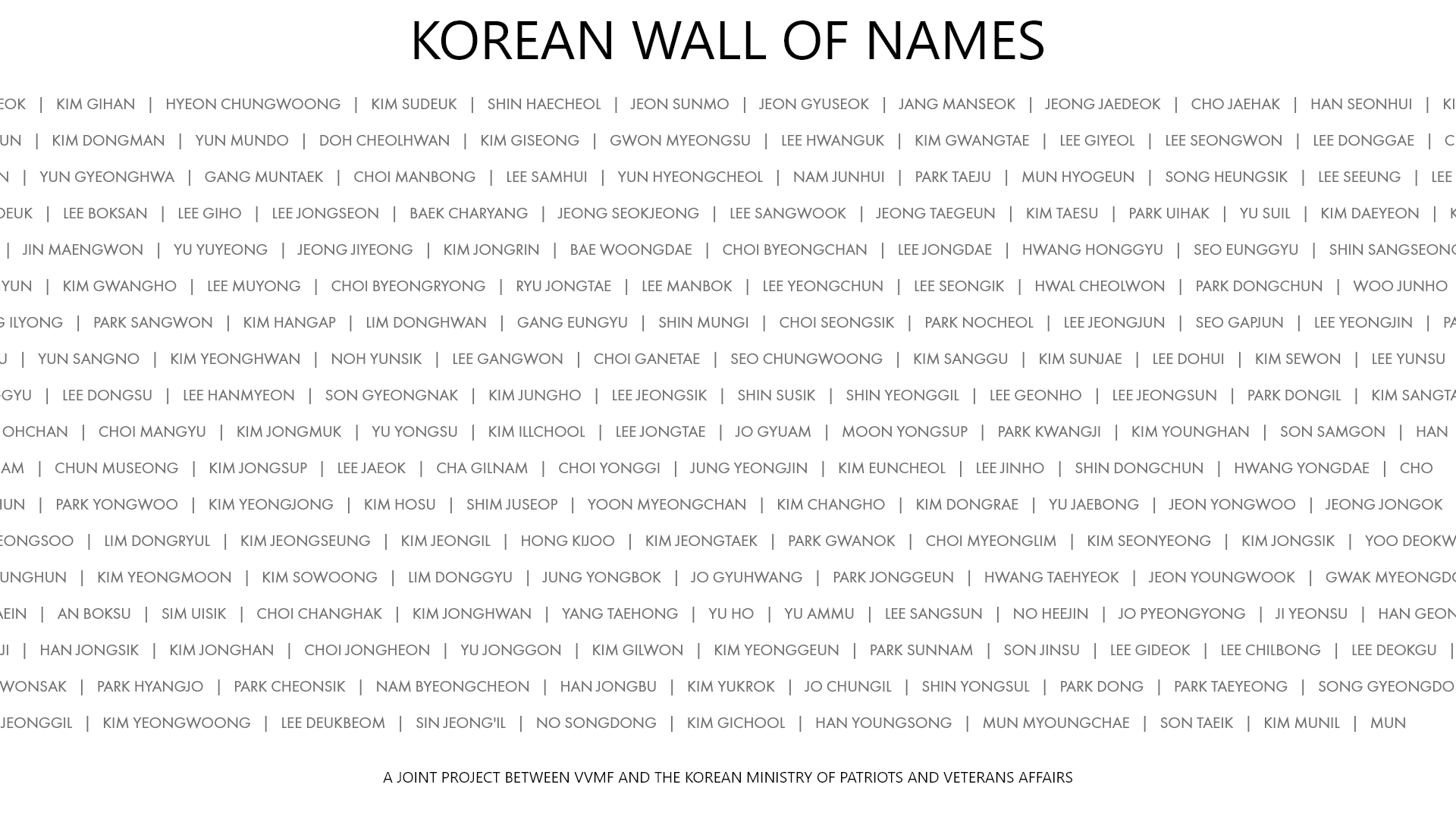
Over 5,000 Koreans died in the Vietnam War. I wanted to show the scale of that loss, while still allowing users to drill down, learn about, and remember each veteran individually. I tried a few concepts to represent this, including an animation that displayed the first time the page loaded. The animation slowly zoomed in from names so small you couldn't tell they were names until they were easy to read. I worked with a developer to create a rough prototype of this animation so VVMF would understand the concept.
Stills from the prototype landing animation.
VVMF decided against the intro animation. However, prototyping allowed us to quickly show the concept, without the significant investment required to create a production ready animation. Other early concepts included an animation where the names slowly came up from the bottom of the screen and faded into the background (below, middle image), versions with large homepage images (below, left), and versions with historical background (below, right).
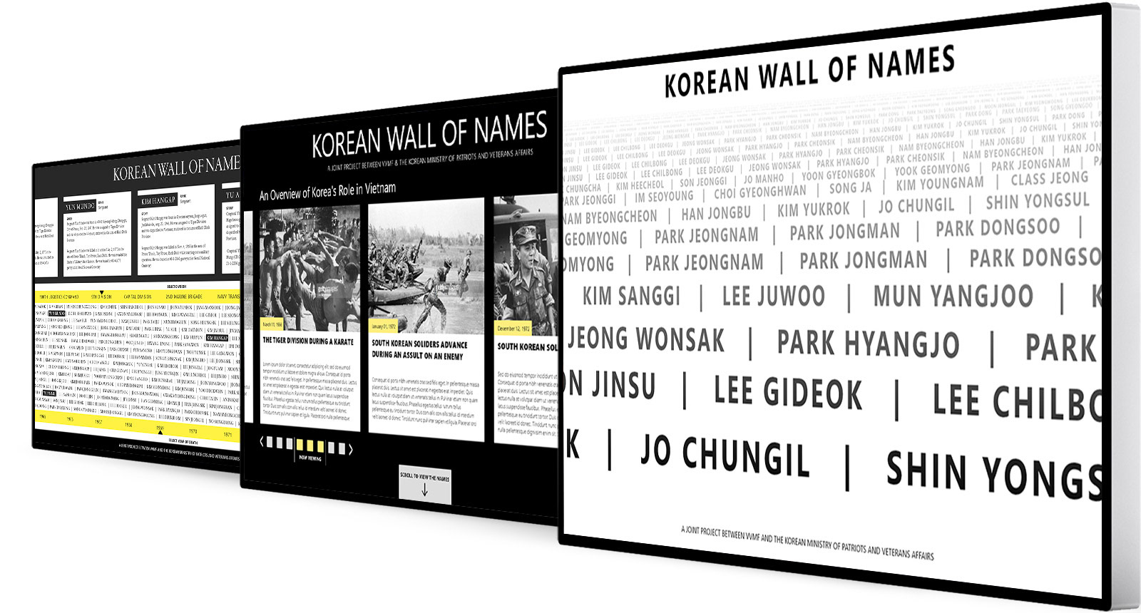
Often simple and clean designs provide the most impact and that proved the case here. In the design VVMF selected (screenshot at the top of this page), I showed the scale by having continuous rows of names slowly scroll across the screen. If you wait, you'll see all 5,000+ names scroll across your screen. I made it possible to learn about the individual by hovering over each name or clicking a name to pull up the full profile. It took a few rounds and a lot of binned mockups, but the selected design checked all the boxes and VVMF really liked it.
A Way for the Living to Remember
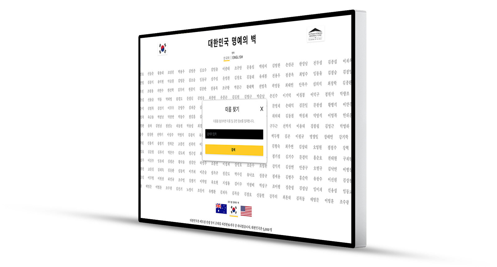
Providing a space for the living to share their memories of those who have passed is a key part of honoring and remembering those no longer with us. We created a space to remember by bringing VVMF's "Remembrance" concept to this site. Visitors to the site can fill out the form (shown below) to create a Remembrance. Each Remembrance is tied to the name the visitor posted it to. Whenever that name is viewed, the Remembrance will be there with it.

Leave a Remembrance form that allows visitors to type a memory and tie it to a name. Visitors also have the option to upload a photo to include with the Remembrance.
Implementation Obstacles
The data included English and Korean translation of each name, plus translations of a bio and other information tied to each name. Initially, I tried Google translate to auto-translate from one language to another so that we could have just one version of the site. However, Google translated the English "Republic of Korea" (South Korea) to the Korean equivalent of "Democratic People's Republic of Korea" (North Korea), so I knew we'd have to use both versions of the provided data. To achieve this, we built the site with both a Korean and an English version. Users can easily switch to the Korean version (shown below) by clicking the links under the site title.
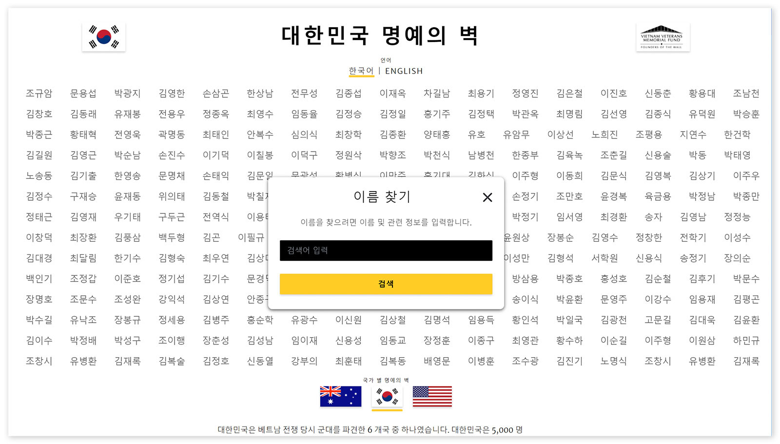
Korean version of the site that visitors can toggle to using the "English / 한국어" links below the site title.
Since Google recommends serving different languages on different URLs, we made sure the URLs each language has a unique URL.
Planning for Images
The data had no images, but we built the site so visitors can add images of the veterans. VVMF has piloted a program to gather photos for each of the names on The Wall. Cultural differences meant uncertainty on whether or not this concept would be successful in Korea. This meant that I had to design a site that looked good with text only profiles and with images added. To do this, I created a horizontal layout so that adding the photo does not add any additional height to the cards that display names and information, which kept a good flow between the cards.

An individual profile with an image. Due to uncertainty over whether or not users would contribute images, the site had to work well with or without images.
A Successful Launch
The initial obstacle of not having any photos turned out to be an opportunity to look at a design problem in a new light. This rethinking led to a unique and impactful site. I enjoyed the chance to iterate and explore all the options.
VVMF is also a great partner to work with. They responded quickly and provided feedback when needed. Their efforts helped us to design, develop, populate, and launch the site in roughly four months. VVMF was very pleased with the site and how we helped them leverage the data in a meaningful way.