VVMF's main site focuses on Vietnam veterans who have died (either during the Vietnam War or as a result of their service). They came to me with a concept that would allow living veterans to (a) document their own biographies and legacies and (b) document their connections to the other veterans (both living and deceased) who they served with.  
My Role
Project Manager: served as the main contact for VVMF, gathered and drafted requirements, monitored timeline and budget, oversaw development. 

UI Designer: sole UI designer for this website, including layout, typography, etc. (used VVMF's existing logo and they populated the site with images).

UX Designer/Researcher: conducted user testing and applied existing knowledge of users to site's design.

Quality Assurance: tested all aspects of site to make sure it met requirements, oversaw additional testing by another team member. 

(A lot of roles? Yes See my about page for more on that.)
Project Management
As a PM, I worked closely with VVMF to understand their goals and vision. Initially, I thought they might want to create a "Facebook for veterans." However, they wisely recognized that there were already a host of groups serving that purpose on Facebook and other platforms. VVMF's actual goal was to gather and preserve as much first- hand information as possible from an aging population of Vietnam veterans. Specifically, they wanted to collect biographical information and document the service-related connections between veterans (living and deceased). 

Collecting the biographical information required careful consideration of the signup process, as detailed below in the UX section. Figuring out how to implement the connecting feature required thinking outside the box and discussions with developers. In order to leverage their existing websites, VVMF wanted the connections to deceased veterans to integrate with their existing platforms: the Wall of Faces and In Memory Honor Roll, tools I'd recently redesigned.

The connection to existing tools was critical for two reasons. First, we wanted to funnel traffic to and from these already popular platforms. Second, we needed to pull in the data from those platforms to the new website. The images and information contained in Wall of Faces and In Memory Honor Roll, would be critical to new Registry users recognizing and connecting with deceased veterans they had served with. To avoid cannibalizing traffic from Wall of Faces and In Memory Honor Roll, we decided to make access to that information only available to logged in Registry users who had created accounts. 

Once I had a grip on the project, I worked with the development team to brainstorm a plan that would limit time, cost, and upkeep, while still meeting all the requirements. Ultimately, we decided to put the Registry on the same server as the existing site and have them share the existing site's database. This cut out the need for developing an API or needing to keep multiple databases current with the same information. 

With the technical details worked out, I drafted a detailed set of requirements. I also worked with the client to get approval on a set of mockups I'd designed (discussed further below). After everything was approved and ready, I turned the design and requirements over to a team of developers and responded to their questions. When development wrapped, I tested the site and confirmed that it met the clients requirements, as discussed under the Quality Assurance heading. I continued to interface with the client and developers as we made tweaks to the site.
UI Design: Selecting Styles

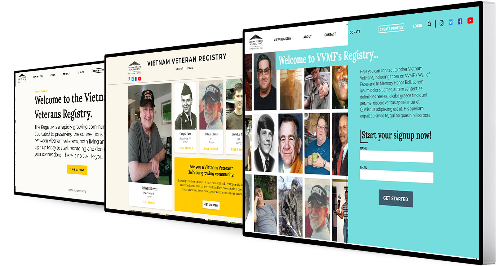
Above are three early Registry homepage mockups that were not selected. 

VVMF wanted to tie the Registry back to their main site, while still making it clear the the Registry was a separate platform. To help their users, VVMF also mentioned the importance of making the site feel approachable. To tie the site to their main one, I used the same yellow that it relies on and used the same font family for buttons and menu items. To give it a more approachable feel, I added a light blue to the yellow and swapped the main site's darker backgrounds for lighter ones. I also used the Lora font family for headings and body text, both for readability and to add a more human feel to the site than Montserrat, which the main site relies on. Getting to the chosen mockup did take several versions. As I usually do, I relied on sample homepages instead of mood boards or style guides when sharing design ideas with VVMF. A few of the mockups that did not make the cut are shown above. 
UI Design: Building Out the Site
Once the client approved a homepage mockup, I used its styles to build out the rest of the site. This included the sign up form; a page that allowed visitors to view profiles; and another version of the page that allowed logged in users to find and connect with living and deceased veterans. I also created a dashboard for logged in users where they could manage their connections and see suggested connections. A separate page let users edit their profiles. Below are several of the areas discussed in this paragraph. 

Both registered users looking to connect and visitors wanting to learn more about those who served can search for existing profiles on the above page. When registered users login, they have additional options to search for veterans on the Wall of Faces and In Memory Honor Roll

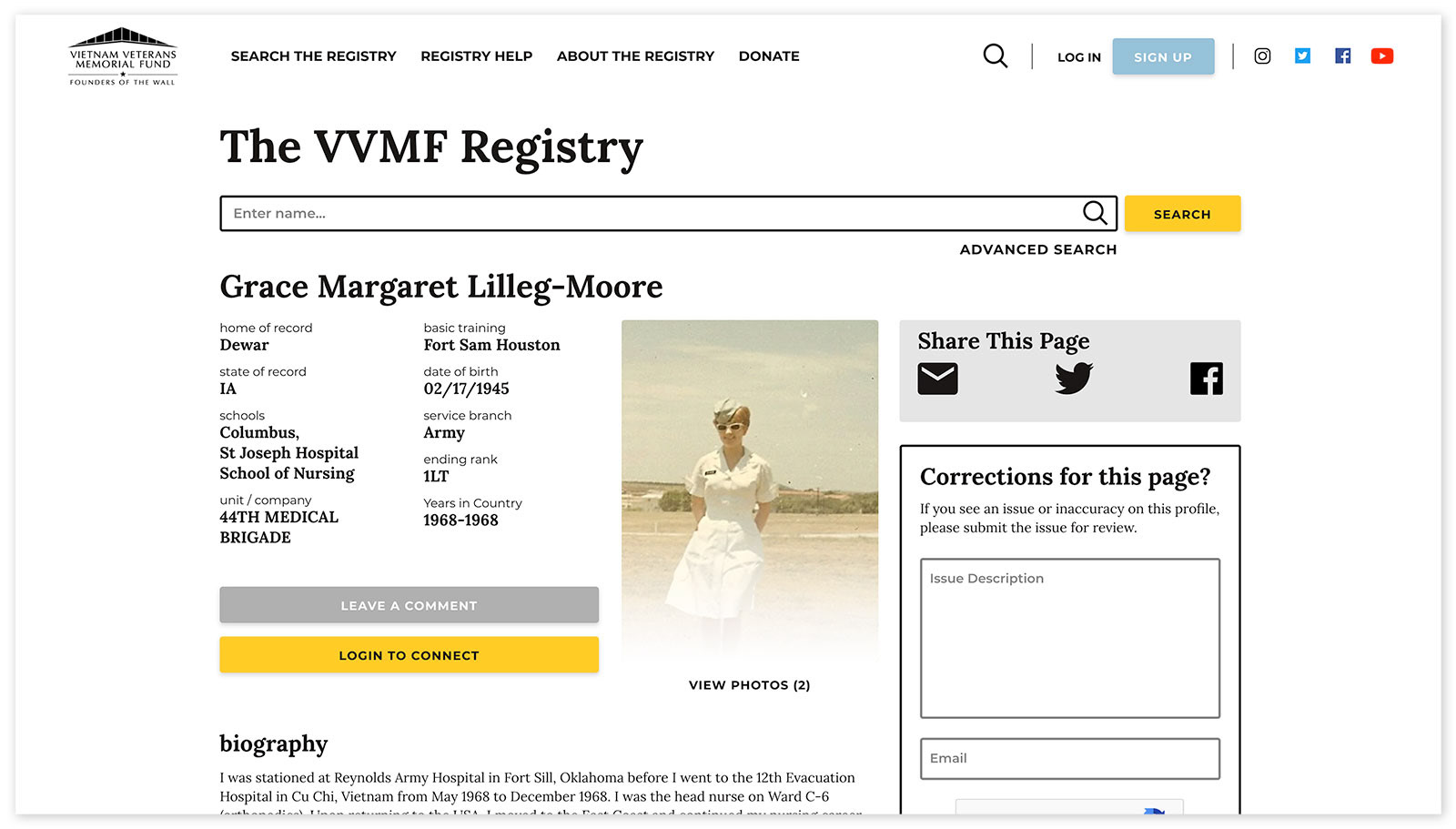
When visitors click a card from the above screenshot, they're taken to a profile page that offers further details on that person. It also includes the option to leave comments or suggest corrections.

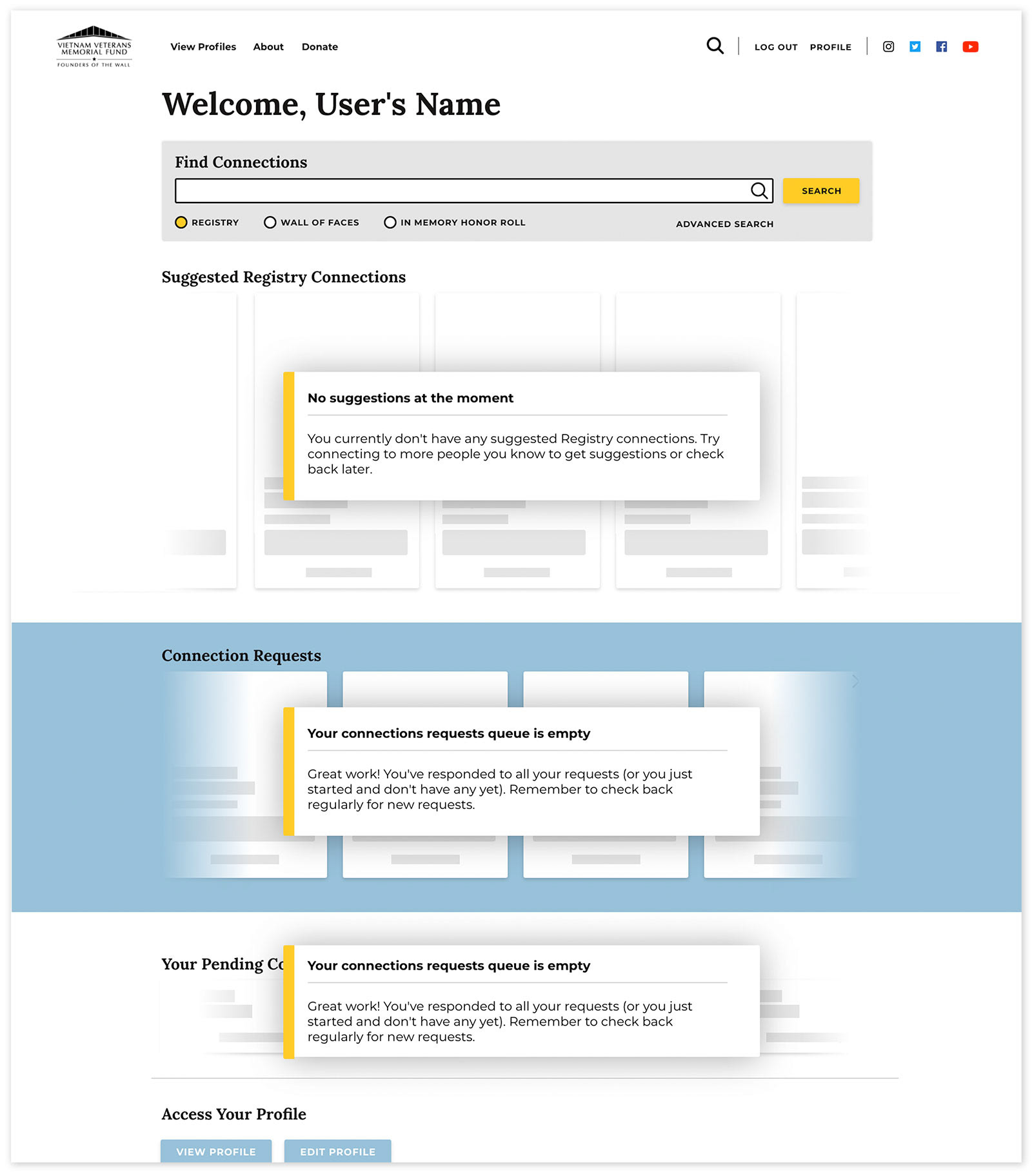
Registered users can login and manage their connections from the page displayed above. This user currently does not have any suggested or pending requests. If they did, those would display as cards, shown in the outlines below the modals. (This image shows a early mockup - the language on the modals was modified for the live site.) 

UX Design/Research: A Simple Signup

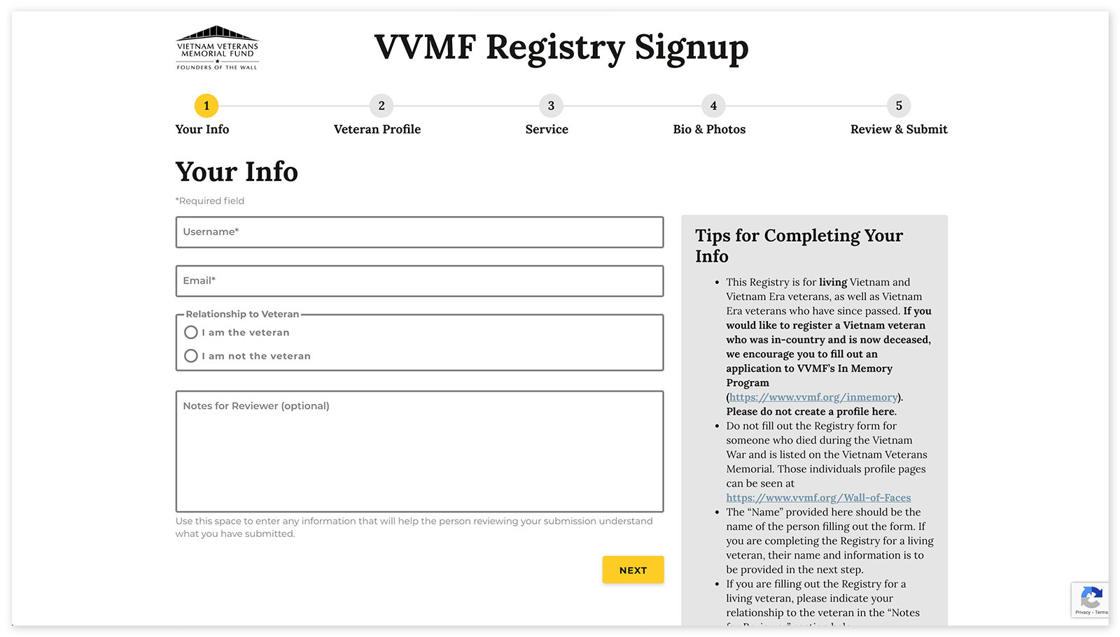
To help users complete the signup process, I broke it down into multiple steps with a clear progress indicator. 

My prior research on VVMF's users, gave me a solid foundation to understand what they would need to make the site usable for them. I knew that the success of this project would depend on a smooth signup process that made it easy for veterans and their families to add profiles. To do this, I researched and followed general best practices - breaking the process up into multiple steps, providing a status indicator, and so on. During testing with a representative user, I learned some things that were unique to our user group. For example, the concept of adding multiple images to one box was confusing. VVMF's goal was for users to upload two photos, so I added two image upload boxes instead of one. 
Quality Assurance
As I do with most projects, after development wrapped, I tested the site to make sure it met the requirements I'd drafted. I provided feedback where it didn't and worked with the developers to modify the requirements when technical limitations would have led to poor performance or time-consuming edits if the requirements were followed exactly. Once I finished my testing, I had a colleague who had not worked on the site conduct additional testing.

Once we had all the bugs worked out, I coordinated the launch of the site with VVMF. It was rewarding to see users populating the site with their profiles. 
Back to Top