The law school's website serves a diverse community with wide-ranging needs. The site needs to appeal to prospective students while also providing current students, faculty, and staff with easy access to the tools and information they need. I collaborated on a visual update to the site and conducted user testing to confirm the site meets all of our users' needs.
My Role
UI Designer: Collaborated with Director of Design & Web Services on a re-design of the site.
UX Designer/Researcher: Used Wayback Machine to locate old website designs and reviewed Google Analytics to determine which of the prior designs performed the best; created user testing questions and tasks; conducted 10 user testing sessions; compiled feedback and insights from sessions; facilitated discussions across departments on how to improve site based on feedback; worked with developers to implement updates.
UX Researcher
We had a tight timeline to launch a significant visual update of the website. The timeline meant that any UX research needed to happen quickly. Recognizing that the site had gone through multiple redesigns over the years, I decided to use that data to guide our decisions on the new design. This required (a) identifying the time period covered by each layout and (b) looking at those time periods in Google Analytics to ascertain which layouts were most successful.
Using the Wayback Machine, I identified date ranges for each of the prior layouts. I then reviewed and compared each date range in Google Analytics. The results clearly showed certain layouts performed better than others. The data also indicated correctable issues with some elements. For example, one version of the site included a set of action buttons in the footer. When another set of less important links were placed immediately before the footer buttons, very few people went past that first set of links. Conversely, when the links were placed further up the page, the footer buttons received significantly more clicks. I noted this and everything else I observerd before moving to the design phase.
UI Designer
I started the design process by talking with the Director of Design & Web Services to make sure I understood the parameters. Part of the request was to redo the color scheme, but we needed to stick within the palette of colors provided by the university. We also had to use the font families currently on the website. Finally, because of the tight turnaround, we needed to limit significant layout changes. During our discussion, I also shared the information I'd uncovered from Google Analytics. At the conclusion of the meeting, we agreed to each independently come up with a few designs.
Keeping what I'd learned from Google Analytics and the design requirements in mind, I started with a few sketches. I next moved to Adobe XD and created a few homepage mockups to clarify my concepts. I focused on the homepage because it had by far the most traffic, so I knew getting it right would be important. (There was also limited time to make significant changes to other pages.)
The brief requested a more professional and polished site, so I reduced the use of green and yellow (GMU's main colors) and focused on another school palette suggested by someone else on the team. I also switched the headings from bold sans-serif Myriad Pro to the more polished and nuanced Minion. I replaced Minion in the body with Pelago. I should add that while I came up with the idea of where to use the fonts, the credit for selecting these harmonious pairings goes to my co-designer.
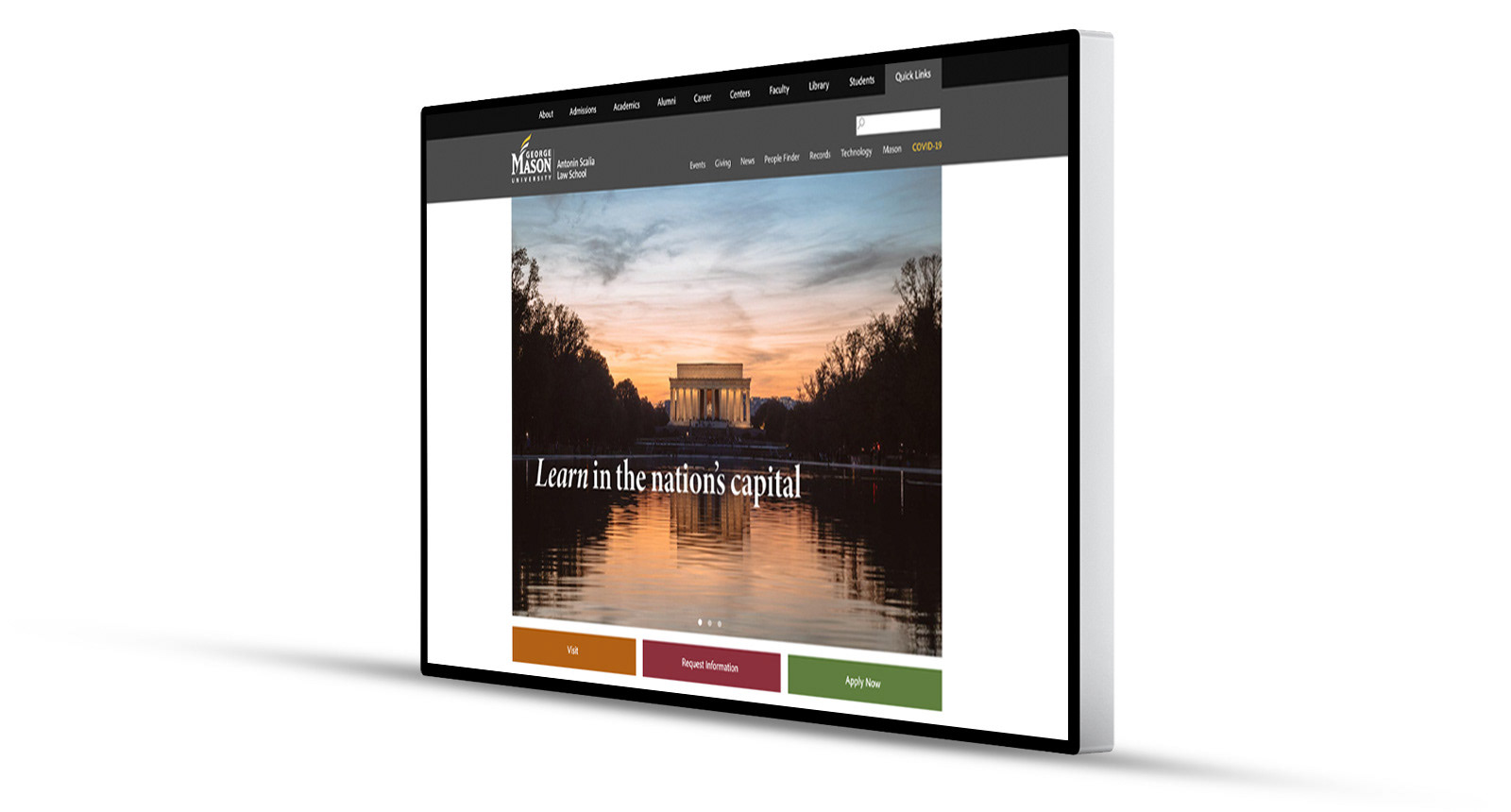
Did I mention this we had a tight turnaround? From the discussions with my co-designer to completing the first set of homepage mockups took a few hours. Before sharing with other stakeholders, we met again and selected our favorites from the roughly six total designs we had. Below is one of my designs that we shared. It's also linked to here.
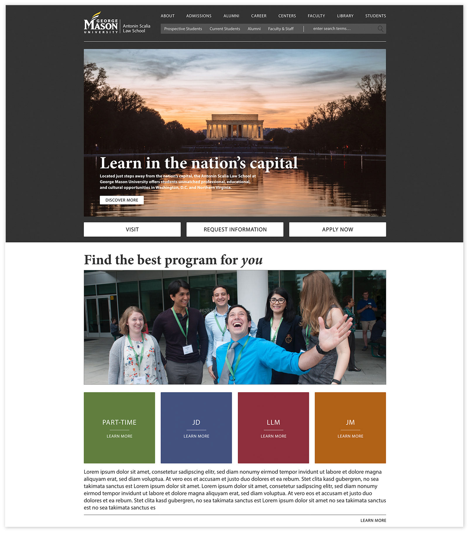
Above is one of the mockups I created. We added elements from my co-designer's work to come up with a final design.
We shared our designs and the stakeholders requested we merge elements from each. We took this feedback and worked together to come up with a new design. Once we had an approved design, I provided suggestions when the developer (the other designer) ran in to issues.
The new site was well-received by our stakeholders. After we had some data, I did a comparison of the new homepage to prior iterations. The new site significantly outperformed the old versions in the areas we focused on and had the second lowest bounce rate in the roughly 7 year period that I reviewed.
UX: User Testing
With the new site launched, we had time to conduct user testing. (We reversed the standard process and did user testing after launching a redesigned site.) Although not ideal, this allowed us to meet the timeline for a redesign and still make updates based on user feedback.
I drafted a set of questions and tasks for user testing and recruited mostly current students to participate. I invited the website developers to sit in on the testing sessions I conducted over Zoom. I mostly stuck to a script during the sessions. However, when I saw a chance to learn something, I set aside the script to ask follow-up questions and dig deeper. For example, when a user declined to contact a librarian — despite seeing the option — I asked why and learned that the user thought it felt too formal. I also made time for the developers to ask follow-up questions. We were all pleased by how much we quickly learned and how testing helped us see the site with new eyes. Having the developers participate kept us all on the same page and got everyone excited about improving the site.
In total, I conducted 10 user testing sessions. At the conclusion of testing, I compiled all the feedback and grouped the issues by department on a Mural board. Then, I worked within the library team (the library oversee's the website) to brainstorm solutions and prioritize fixes. We quickly fixed all the issues we could without getting input from other departments. For the remaining items, I drafted a document detailing the issues we'd identified and offering potential solutions. Then I met with and worked with the relevant departments to come up with fixes that worked for them. In the end, we made changes to content on multiple pages, edited the main menu, updated a contact form, added icons on videos, created a new research FAQ page, and more.
To solidify our work, I created and shared a document that included general principles we encountered repeatedly throughout our tests. For example, "Students don’t have much time and may abandon tasks that appear time-consuming." The document gives everyone something to start from when making future modifications to the website.
The redesign and user testing edits led to a more visually appealing and usable website. I enjoyed working on the design with another talented designer. I also appreciated the chance to work across departments to improve the site.